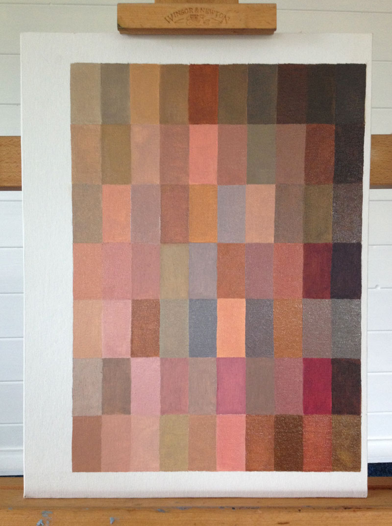
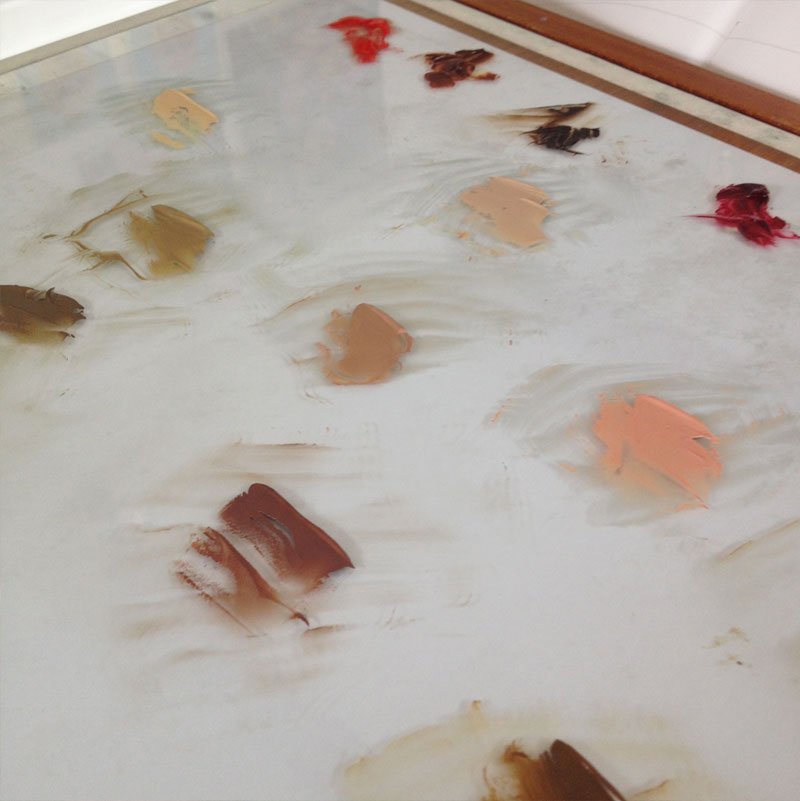
I have been experimenting with some colour mixing exercises in the studio recently and painted a particularly useful flesh tones chart.
The purpose of this particular exercise is to try and mix as many different flesh tone hues from limited colour palettes. I created a grid made up of 7 rows of 10 rectangles on a 16 x 12 inch canvas board, meaning I could try and document 70 different flesh tones.
Experimenting with Flesh Tones in an Oil Paint Colour Chart
I found the exercise in the brilliant Portrait Painting Atelier by Suzanne Brooker and while the first few palettes took me a while to accurately mix, I picked up speed as I worked through the chart.
Colour Mixing Recipe Book
As I worked through each palette I found it useful to make notes about the results in my sketchbook. Noting down the proportions of pigment in each mix, I essentially made a flesh tone colour mixing recipe book.
I’ve jotted down some of the features of each palette as provided by Suzanne Brooker along with my key findings as follows:
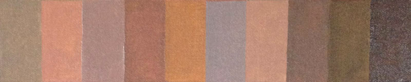
1) Analogous Earth Palette
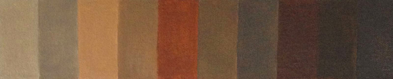
1) Analogous Earth Palette
- Yellow Ochre
- Burnt Umber
- Burnt Sienna
- Ivory Black
- Flake White
The first row shows the flesh tones created from an analogous earth palette which contains a common hue between the colours. This common earth hue helps make a harmonious colour strategy which could be brought to life in a portrait through the introduction of a few contrasting colour notes or highlights.
One of the main ways to create these different hues was to use varying amounts of ivory black in the mixtures. The warmer swatches were created with predominantly burnt sienna and yellow ochre while burnt umber and ivory black helped create the darker tones.
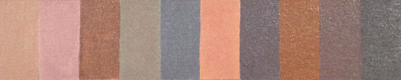
2) Modified Analogous Earth Palette
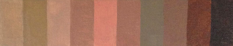
2) Modified Analogous Earth Palette
- Yellow Ochre
- Burnt Umber
- Burnt Sienna
- Ivory Black
- Alizarin Crimson
- Cadmium Red
- Flake White
In row two the analogous earth palette is expanded with the introduction of two reds; cadmium red and alizarin crimson. The warm cadmium red helped create the ‘peach coloured’ tones to the left of the row while the cool alizarin crimson created the more purple hues.
I found this palette the most difficult to mix the different flesh tones from. Not because of a narrow colour range but because there was more to work with and balance within the mixtures.
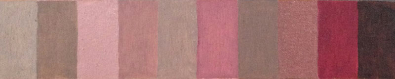
3) Low-key Primary Palette
3) Low-key Primary Palette
- Yellow Ochre
- Flesh Ochre
- Blue Black
- Flake White
I was surprised by the intensity of the flesh ochre when used in this palette and it took a few attempts to make sure I didn’t include too much of the pigment and overpower the other colours.
What was interesting about this exercise was using the blue of the blue back as the primary. When mixed with the yellow ochre it created some super green hues that helped tone down the flesh ochre.
4) Cool Primary Palette

4) Cool Primary Palette
- Yellow Ochre
- Alizarin Crimson
- Ultramarine Blue
- Flake White
I found this palette to also be a little tricky and unhappy with the accuracy of some of the swatches I returned to them the next day and reworked them.
However, what was a great exercise within these mixes was creating the darker tones from the source pigments of the three primaries. Mixing the yellow ochre, alizarin crimson and ultramarine blue helped achieve the dark neutrals shown to the right hand side of the row.
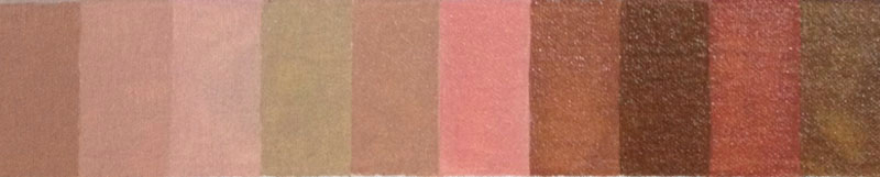
5) Warm Primary Palette
5) Warm Primary Palette
- Cadmium Red
- Cadmium Yellow
- Phthalo Turquoise
- Flake White
As with the cool primary palette this one also lacked a true dark colour and so the darker hues were created by the source pigments of the primaries creating the neutral.
As with the flesh ochre in the low-key primary palette, the phthalo turquoise was another dominant, intense colour. It took a few attempts to make sure I picked up the smallest amount of the turquoise with the palette knife.
The cadmiums red and yellow created the flesh base of most of the hues with the introduction of the turquoise and flake white to cool, lighten or darken where necessary.
6) Cool Complementary Palette
6) Cool Complementary Palette
- Alizarin Crimson
- Raw Umber
- Flake White
I particularly enjoyed mixing the tones in this palette as there were less pigments to balance and I enjoyed the challenge of trying to unlock the variety of hues from such a limited range.
The complementary cool red (alizarin crimson) and cool green of raw umber helps make another harmonious palette. I found that I had to use a lot of flake white to create the lighter hues due to the lack of a yellow within the palette.
7) Warm Complementary Palette
7) Warm Complementary Palette
- Cadmium Red
- Sap Green
- Flake White
Similar to the cool complementary palette in row six but with the warm cadmium red and sap green used. With most of these mixes I would start with either the red or the green lightened with the flake white before gradually introducing the other complementary colour in very small quantities.
Mixing flesh tones
A Reference for Portraits
I think the colour chart should provide a great reference for portrait painting going forward. It will be important to remember that the swatches are painted in their opaque format on a pure white canvas board whereas within a portrait they will more likely be used on a toned ground, over a previous layer of colour or thinned in a glaze.
While the chart should prove to be a handy visual reference for palette choices and ideas, it is the notes on each flesh tone in my ‘recipe book’ that I think will prove most useful.
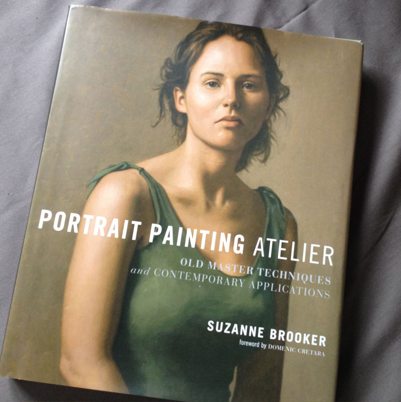
Portrait Painting Atelier by Suzanne Brooker